#SVG
More about SVG. Note that the example code is written in JSX (or React), not ordinary HTML.
#Animated Wires
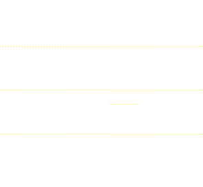
Make the line, using line or path.
<svg viewBox="0 0 50 50" className="bg-neutral-900 max-w-[100px] mx-auto">
<g>
<line x1="0" y1="0" x2="0" y2="50" stroke="white" strokeWidth="1" />
</g>
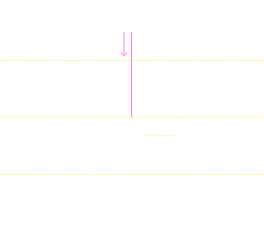
</svg>Make it a mask.
<svg viewBox="0 0 50 50" className="bg-neutral-900 max-w-[100px] mx-auto">
  <g>
    <rect x="0" y="0" width="50" height="10" fill="red" mask="url(#line)" />
    <mask id="line">
      <line id="" x1="0" y1="0" x2="0" y2="50" stroke="white" strokeWidth="1" />
    </mask>
  </g>
</svg>
Add animation.
<svg viewBox="0 0 50 50" className="bg-neutral-900 max-w-[100px] mx-auto">
  <g>
    <rect
      x="0"
      y="0"
      width="50"
      height="10"
      fill="red"
      mask="url(#animated_line)"
      style={{
        animation: "to-down linear infinite 2s",
      }}
    />
    <mask id="animated_line">
      <line x1="0" y1="0" x2="0" y2="50" stroke="white" strokeWidth="1" />
    </mask>
  </g>
</svg>
@keyframes to-down {
0% {
transform: translateY(-10px);
}
100% {
transform: translateY(50px);
}
}Make styles.
<svg viewBox="0 0 50 50" className="bg-neutral-900 max-w-[100px] mx-auto">
  <g>
    <line x1="0" y1="0" x2="0" y2="50" stroke="rgb(50,50,50)" strokeWidth="2" />
    <rect
      x="0"
      y="0"
      width="100%"
      height="20"
      fill="url(#line_color)"
      mask="url(#animated_line_fancy)"
      style={{
        "--height": "20px",
        animation: "to-down-2 linear infinite 3s",
      }}
    />
    <defs>
      <linearGradient id="line_color" x1="0" x2="0" y1="0" y2="1">
        <stop offset="0%" stopColor="rgba(255,0,255,0.1)" />
        <stop offset="100%" stopColor="rgb(255,100,255)" />
      </linearGradient>
    </defs>
    <mask id="animated_line_fancy">
      <line x1="0" y1="0" x2="0" y2="50" stroke="white" strokeWidth="2" />
    </mask>
  </g>
</svg>
@keyframes to-down-2 {
0% {
transform: translateY(calc(var(--height) * -1));
}
100% {
transform: translateY(100%);
}
}Most of these similar things are using the same technique. Mask out an animated block, putting some animations and probably designed some parts in Figma or other SVG editors.
Unkey's landing page is a nice example.
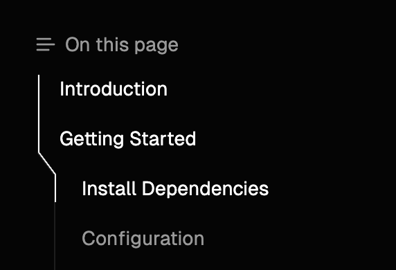
#Clerk TOC
I made a clerk-like style Table Of Contents (TOC) on Fumadocs, you can try it out and play with the nice TOC.
To implement it, we have to render the TOC outline on server, without client-side JavaScript to make it compatible with SSR.
Since we're on server, we don't know the exact positions of elements.
My approach is to use absolute positions, render the outline as different "components", and snitch them together.
This isn't hard, but we also want to render a highlighted part of outline where the items are active, or their corresponding heading is visible in the viewport.
Like:

I'll call it the thumb. It has to be animated, so we can't just change the color of these outline components.
We cannot animate the thumb with simple CSS solutions, lucky we have the exact rendered positions of TOC items, since the thumb is meant to be interactive, it is rendered on client!
Using the information from our browser, we can construct a "mask map" on client, look like this:
The method to construct this map is SVG - yes, our old friend.
<svg xmlns="http://www.w3.org/2000/svg" viewBox="0 0 14 236">
  <path
    d="M1 0 L1 20 L13 36 L13 56 L1 72 L1 92 L13 108 L13 128 L1 144 L1 164 L1 180 L1 200 L13 216 L13 236"
    stroke="white"
    strokeWidth="1"
    fill="none"
  />
</svg>
The d property of SVG <path /> isn't a nonsense auto-generated string, it's a list of commands.
See the Web Docs for more details, it's quite a powerful tool.
With our new tool, we can tell SVG to render a line connecting each point of the outline.
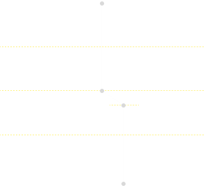
This constructed a SVG that's identical to our original TOC outline pre-rendered on server.
Similar to the technique we've learnt from Animated Wires, we can use the CSS mask-image property to mask an animated div block to render the thumb - a highlighted part of outline.
<div
  style={{
    maskImage: `url("data:image/svg+xml,${
      // URI encoded SVG image
      encodeURIComponent(`<svg xmlns="http://www.w3.org/2000/svg" viewBox="0 0 14 236">...</svg>`)
    })`,
  }}
>
  <div
    style={{
      width: 1,
      height: thumb.height,
      transform: `translateY(${thumb.top}px)`,
      transition: "all 500ms",
      backgroundColor: "white",
    }}
  />
</div>
Check the source code to see my implementation in React.js.
Huge thanks to Clerk for inspiring me on this, I've never thought the TOC of a documentation site can be that interesting to play with.